Introducing Projeto Motor
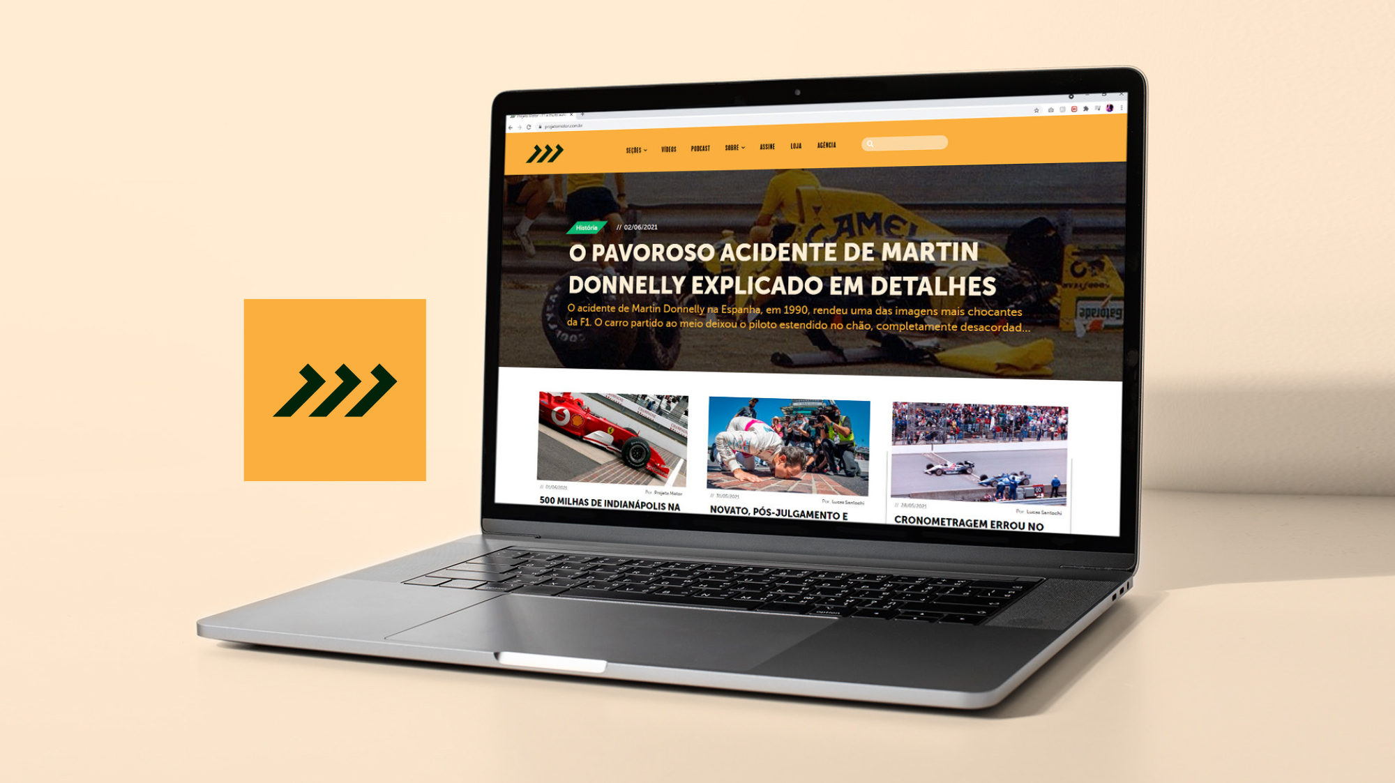
YouTube channel with a strong digital presence with over 100,000 subscribers on YouTube. The Projeto Motor is a channel specialized in F1 and motorsport with a focus on analysis, history, and fun facts don't know to the public. The proposal is to present the world of slopes from a different angle, in a dynamic and uncomplicated way.
Challenges
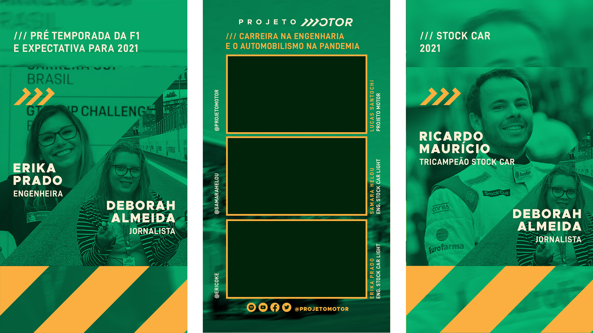
The channel exists since 2016, the old brand met the demand at the time. However today it has become outdated. Therefore, the challenge was to update the brand through a redesign for reduced applications such as social media avatars. As well as revitalizing communication keeping the best practices already adopted and incorporating new visual resources.
- Projeto Motor
- Redesign launch: 2021.
- São Paulo-SP, Brazil.
- I designed the visual identity, identified target audience (users), logo redesign, layout for social media, branded stationery, institutional materials, and motion graphics with After Effects for the intro video.
Values of brand
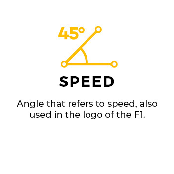
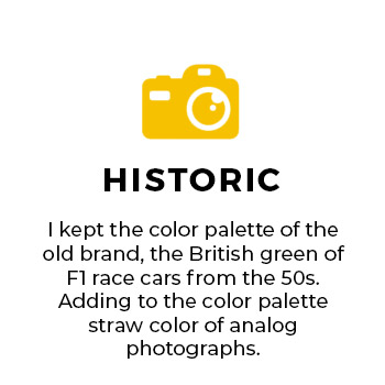
Symbolic charge associated with the brand that helped in the development of the brand's graphic signature.
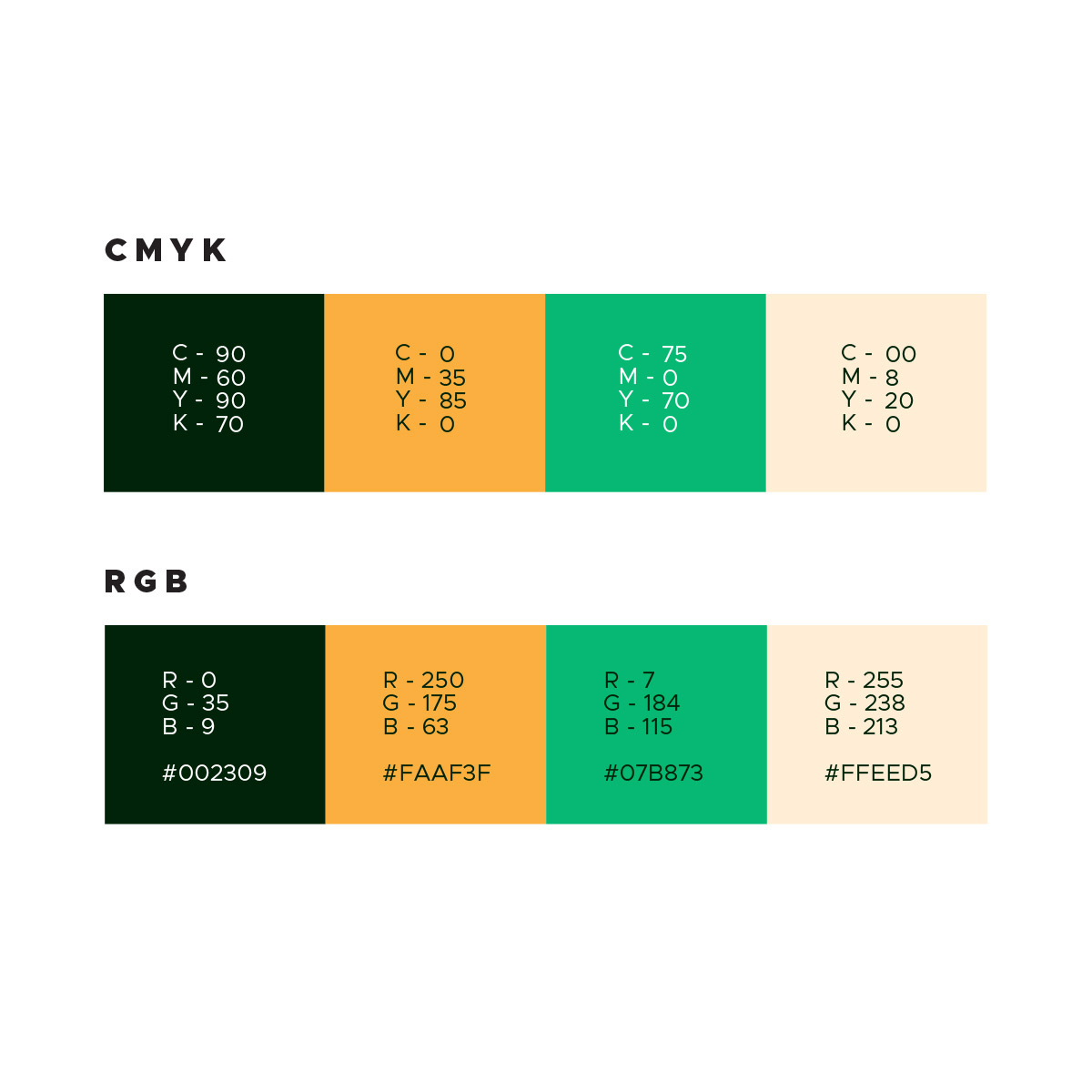
Brand's colors
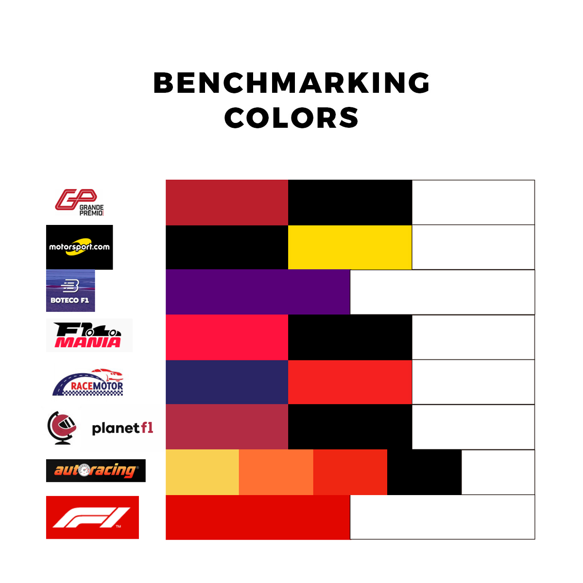
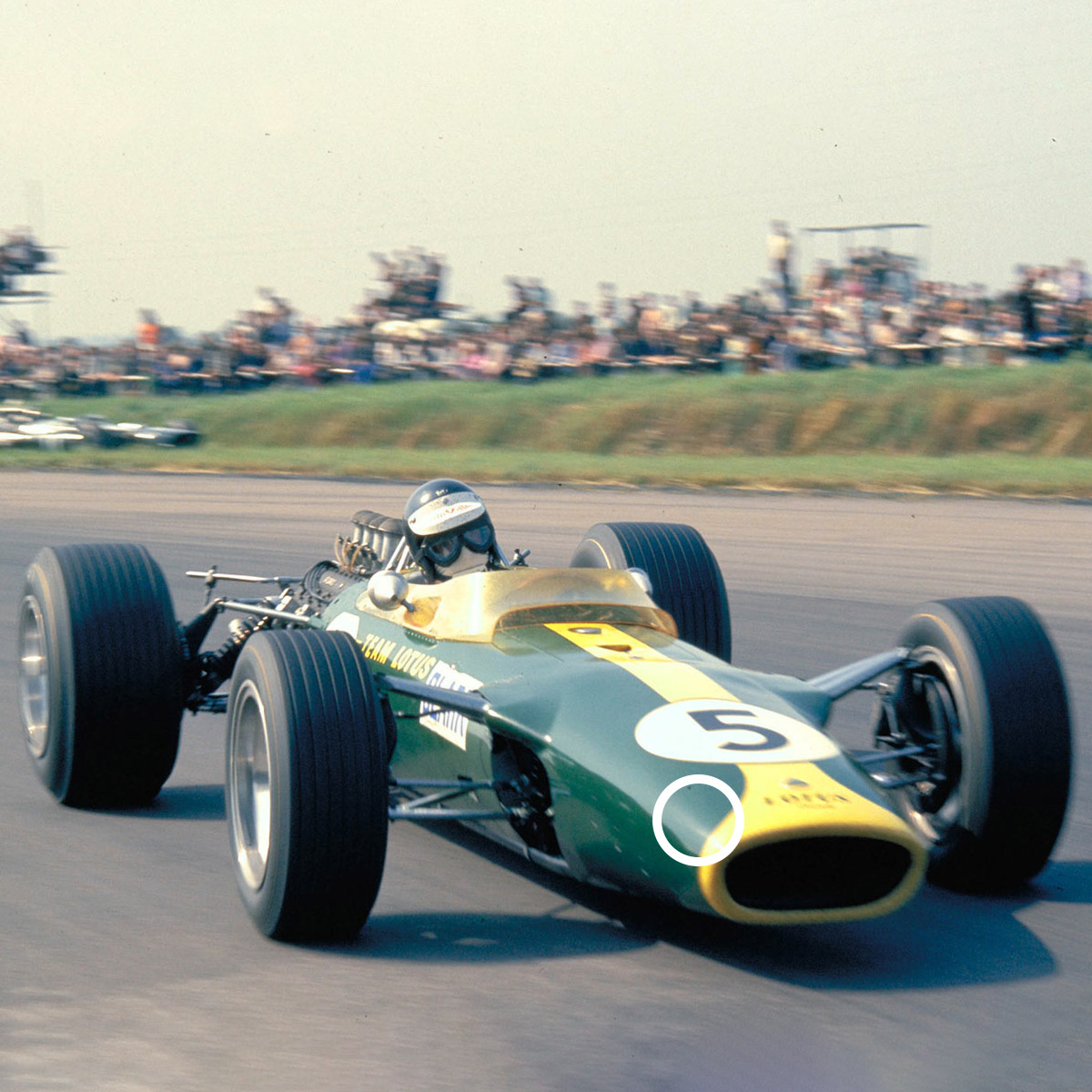
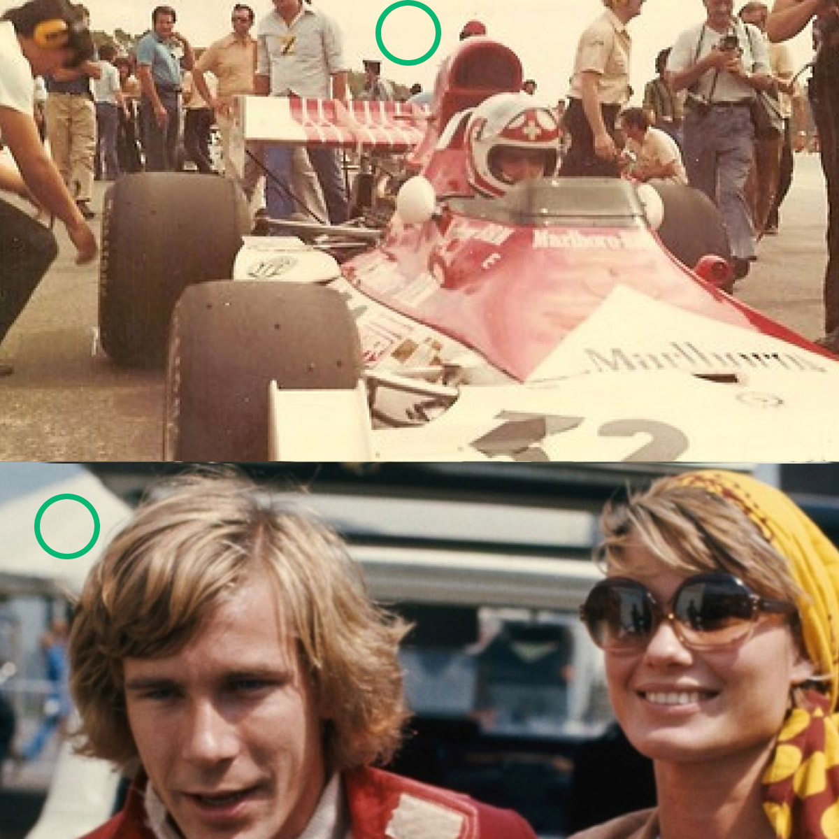
Color is an extremely important point for a visual identity, it is through it that we express part of our brand's positioning. As it is the first thing we identify, it must bring the first impression to the observer's eyes, so that the emotional charge is complete. In this project, I benchmarked with other companies in the sector, where I could identify that most use shades of red. I focused the inspiration on the old brand's color palette and built the color scheme for the Projeto Motor visual identity by reusing the old brand's british green and yellow and adding the straw color of analog photos to the color palette.
Visual signature: redesign of shapes
Let's go now to the construction and how it was thought until we reach the final result. I used a sans serif typography similar to the old brand, I chose to style the letter M to refer to the zebras of the F1 race track, also using the 45º angle to refer to speed.

Results
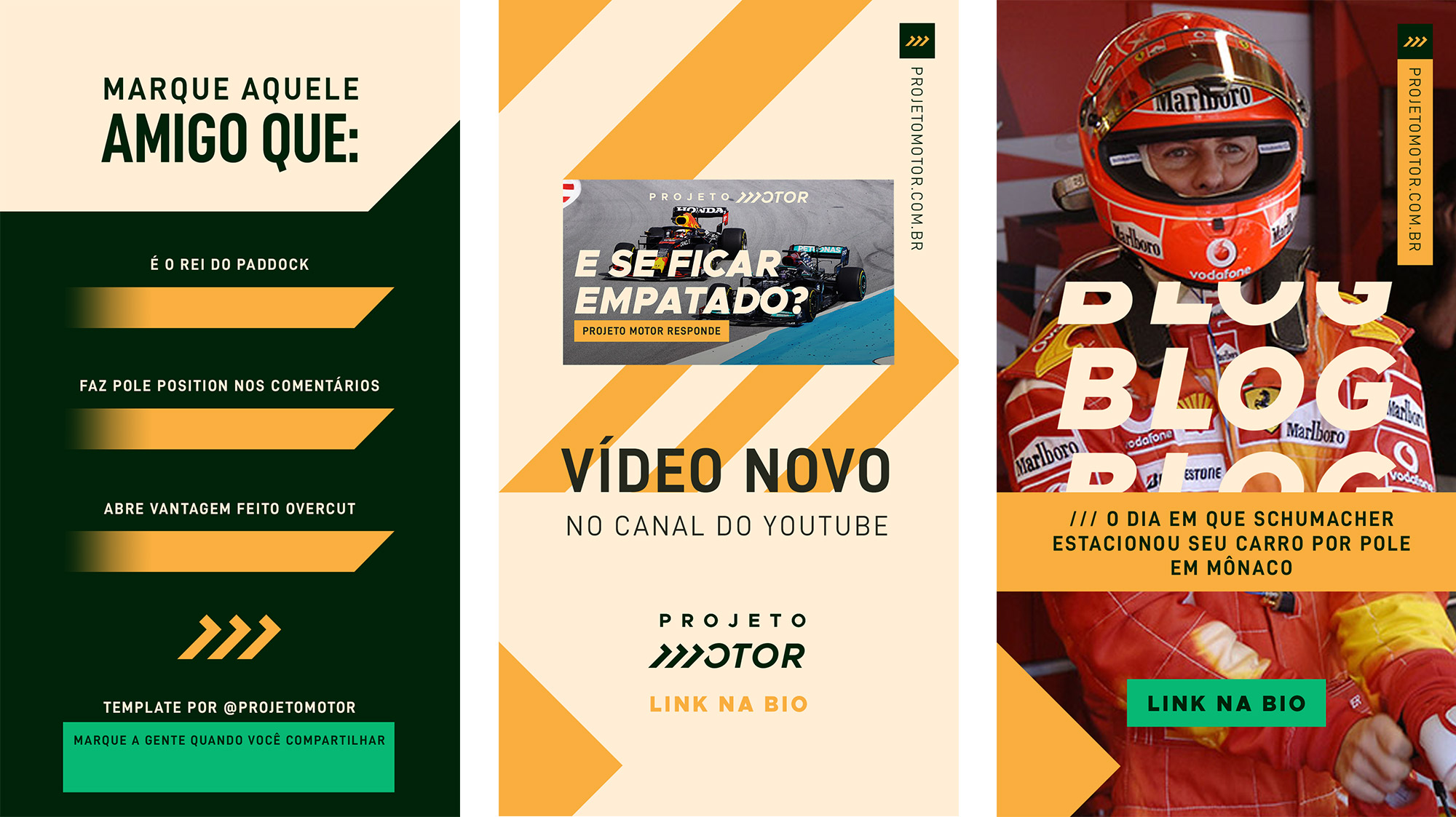
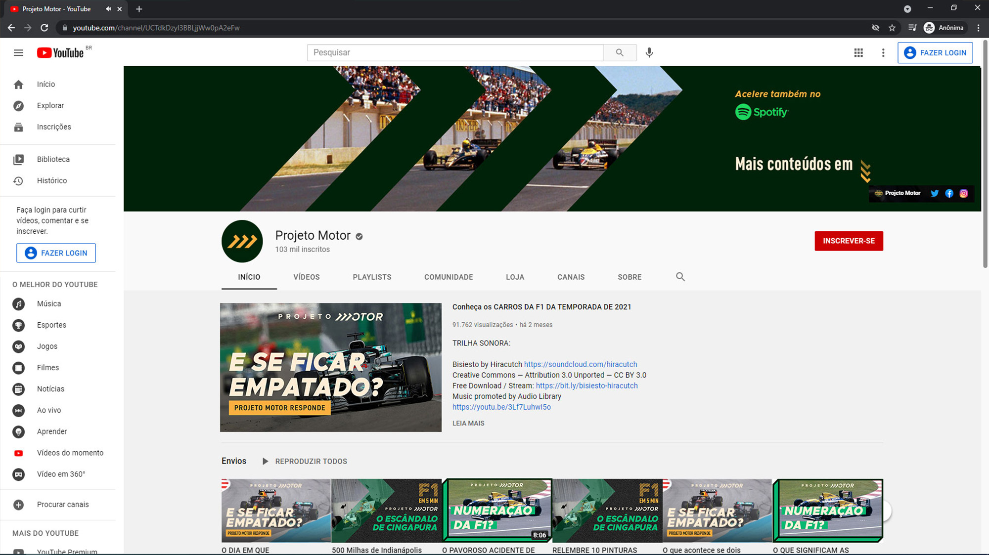
The redesign of the Projeto Motor logo was well received by the public, the partners also approved the first proposal presented. On the Youtube channel, after the launch of the new brand, the number of followers grew 10% in 30 days. Reaching 110,000 followers. Access to the blog also increased after launch. I believe that the new visual identity made it possible to professionalize the arts of communication, going hand in hand with the incredible text produced by the editorial committee of Projeto Motor: Lucas Santochi and Bruno Ferreira. The fact that I created an editable pattern in Photoshop and Adobe Premiere for posts to Youtube, Instagram, IgTv (videos) reduced the partners' time in preparing the arts on a day-to-day basis, as they are the ones who produce it.
Testimonial
Danielle is a great professional. Very talented and technical, she is also very obedient to schedules and deadlines. Her projects were always delivered at a high level and without the need for major adjustments.
— Lucas Santochi Co-Founder of Projeto Esporte and Projeto Motor